Hello my fellow mystery fans! I want to read all my books in every animal cafe— raccoons included!
Sponsored by The Separatists by Lis Wiehl
 Bestselling novelist and national legal and political news analyst Lis Wiehl takes us behind the anchor’s desk and into a country being torn apart.
Reporter Erica Sparks heads to North Dakota, to investigate Take Back Our Homeland, a large secessionist group threatening our Union.
When Erica discovers a potential informant murdered in her Bismarck hotel, she realizes Take Back Our Homeland might be even more dangerous than she thought. She unwittingly becomes one of the key players in the story she’s reporting. Her fear and anxiety escalate – for her family and her own life.
I can’t get enough of Juniper Song!
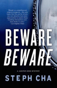 Beware Beware (Juniper Song, #2) by Steph Cha: While Song ended up investigating way more than she’d ever imagined, or wanted to, in the first book (Follow Her Home) it was really just something that started as a favor for a friend. Now she’s back, and this time interning as a private detective—I mean, what else would a woman do who seems to have tragedy and murder follow her? She’s finally given her first solo case to tear her teeth on that seems easy enough: follow Daphne Freamon’s boyfriend Jamie Tilley. But this is Song, and noir, so before she can get a handle on what Tilley is up to she’s called to help him when he finds himself the only person left at a party with a dead Hollywood actor. Not one to ever have peace, Song’s roommate also seems to be finding herself in danger (which Song is trying to protect her from). Cha brings the Korean communities in L.A. alive while creating a hell of a noir heroine who sees the world as it is: always with a bit of a dark stain.
For fans of true crime:
Viola Davis, Julius Tennon, and a bunch of production companies are creating a documentary series that will follow two inmates on death row in order to re-examine their cases.
Watch the official trailer for Law & Order True Crime: The Menendez Brothers starring Edie Falco.
There’s a true crime wine club.
A true crime podcast helped exonerate an imprisoned man.
I’ve been seeing a bunch of articles about Netflix’s The Keepers (fantastic but brutal, ALL THE TRIGGER WARNINGS) and found this L.A. Times article interesting in its questioning of why true crime mostly focuses on female victims. For me one of the things that made The Keepers so successful is that it focused mostly on giving voice to the victims rather than obsessing over the killer/attacker/suspect. And if you’re looking for true crime novels that give voice to victims, and can handle brutal reads, I recommend two recent reads: The Fact of a Body: A Murder and a Memoir by Alexandria Marzano-Lesnevich and The Grim Sleeper: The Lost Women of South Central by Christine Pelisek.
New evidence in the case made famous by Truman Capote’s In Cold Blood has lead producers to create a new re-examining documentary.
Quartz: True Crime Fans Should Listen to This New Podcast Created by San Quentin Inmates.
Grabs the reader from the first page!
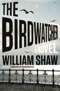 The Birdwatcher by William Shaw: William South, a police sergeant in Kent, is assigned to a murder case but he has two reasons he tries to get out of it: first, he’s a birdwatcher and he doesn’t want to miss out on the arrival of migrating birds; second, HE’S A MURDERER HIMSELF. What?! Clearly no one else seems to know his second reason, seeing as he’s police and his boss doesn’t care that he doesn’t want the case. He has to take it. Complicating his life further: the murder victim is not only one of South’s neighbors, but also a birdwatching friend. Oh, and he’s got a new partner, a sergeant relocated from London: Alexandra Cupidi. Cupidi comes with her own baggage, including a teen daughter who is pissed her life has been uprooted. Between the current murder case (turns out South maybe didn’t know his birdwatching buddy that well), the flashback chapters to his childhood in Ireland, and the murder of his father, there is plenty of mystery to get sucked into. The birdwatching, Cupidi’s character, and her daughter are added bonuses to a solid story. If you’re looking for a satisfying-from-beginning-to-end read don’t miss this one.
Fiona Barton does it again!
The Child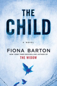 by Fiona Barton: I was a fan of Barton’s debut The Widow, since I can’t fathom how people defend their spouses or stay with them after they’ve committed horrible crime(s) and it took me deep into that land with a balance of unsettling and real characters. (The audiobook’s narrators were great!) So I had high expectations for The Child and was thrilled that Barton delivered another great novel while being different from her first. This time around we get changing point of view between four women: Emma, Kate, Angela, and Jude. You get a slice of each woman’s current life: Emma, a book editor, is having emotional problems and seems to be hiding something from her husband Paul; Jude is Emma’s mum and their relationship is strained; Kate is a reporter trying to figure out the mystery behind baby bones discovered in a now construction site; Angela is a mum whose newborn baby disappeared years ago. Each woman is drawn to the news of the baby skeleton, drawing the reader deeper into the women’s lives… The depth of Barton’s characters elevates this novel into a satisfying, emotional mystery with a twist.
Recent paperback releases:
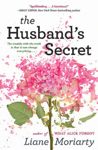 The Husband’s Secret by Liane Moriarty
The Killing Lessons by Saul Black
Grace to Finish (A Manor House Mystery) by Julie Hyzy
Before the Fall by Noah Hawley
Browse all the books recommended in Unusual Suspects previous newsletters on this shelf. And if you like to put a pin in things there’s an Unusual Suspects board.
Until next time, keep investigating! And in the meantime come talk books with me on Twitter and Litsy–you can find me under Jamie Canaves.

 The Gentleman’s Guide to Vice and Virtue
 Spoonbenders
 The Girl of the Lake: Stories
 Everyone’s a Aliebn When Ur a Aliebn Too: A Book
 The Fourth Monkey


 Lilly Singh joins the cast of the
  Eli Roth & Jack Black in talks for
  The first trailer for
  New People
 Quackery: A Brief History of the Worst Ways to Cure Everything