Sponsored by Tor Teen
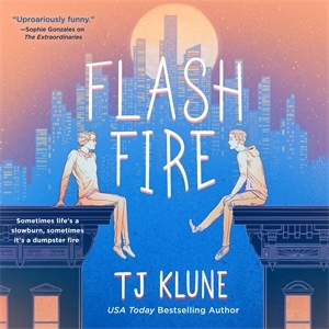
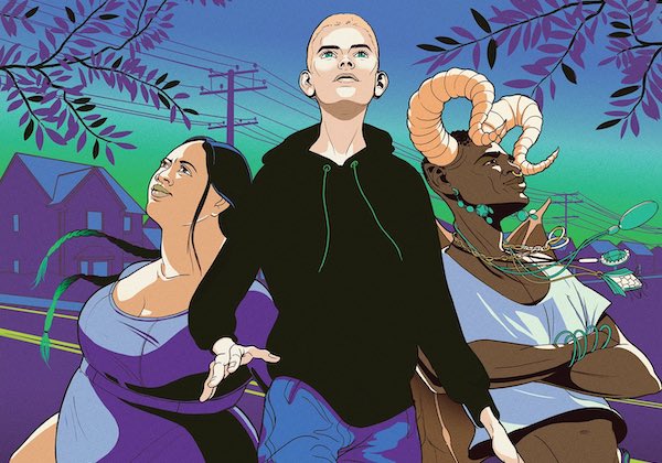
Flash Fire is the explosive sequel to The Extraordinaries by New York Times and USA Today bestselling author of The House in the Cerulean Sea, TJ Klune!
Nick landed himself the superhero boyfriend of his dreams, but with new heroes arriving in Nova City it’s up to Nick and his friends to determine who is virtuous and who is villainous. Which is a lot to handle for a guy who just wants to finish his self-insert bakery AU fanfic.
First editions of the Flash Fire hardcover come with a reversible jacket!
Hey YA Readers!
There might not be a lot of news, but the hero piece this week is a big deal. Let’s dive in.
YA Book News
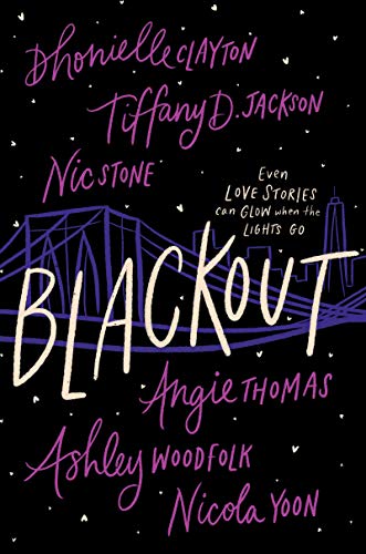
- The Obamas will bring Blackout, by six stellar Black YA writers, to Netflix as an “event.” This looks spectacular and knowing the book is outstanding, I know I can’t wait.
- Speaking of one of those stellar authors, here’s a great interview with Angie Thomas.
- At The New York Times, Marjorie Ingall asks why there are so many Holocaust books for kids. The bulk of the discussion is on younger children’s materials as opposed to YA, but this is great reading for anyone invested in kid lit.
- Fear Street is leading to an interest in adapting more 90s YA horror. Nostalgia is both awesome and exhausting.
- Dungeons + Dragons novels and graphic novels for YA readers will be coming soon.
New YA in Hardcover
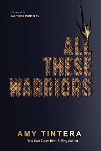 |
All These Warriors by Amy Tintera (series)
Creatures of the Night by Grace Collins
Faking Reality by Sara Fujimura
Flash Fire by TJ Klune (series)
The Great Big One by J. C. Geiger
The Mythic Koda Rose by Jennifer Nissley
Radha and Jai’s Recipe for Romance by Nisha Sharma
The Right Side of Reckless by Whitney D. Grandison
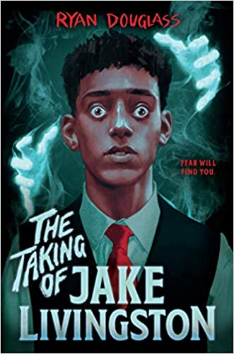 |
The Taking of Jake Livingston by Ryan Douglass
Up All Night edited by Laura Silverman
When All The Girls are Sleeping by Emily Arsenault
When We Were Strangers by Alex Richards
Wings of Shadow by Nicki Pau Preto (series)
XOXO by Axie Oh
New in Paperback
Accidental by Alex Richards
The Extraordinaries by TJ Klune (series)
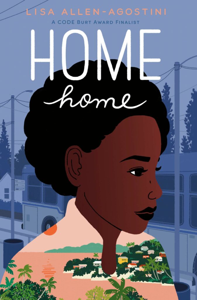 |
Home Home by Lisa Allen-Agostini
Parachutes by Kelly Yang
The Unleashed by Danielle Vega (series)
When She Reigns by Jodi Meadows (series)
YA On Book Riot This Week
- White gatekeeping in YA harms actual teens, not social media
- Loved Legendborn? You’ll want to try these 15 books like Legendborn.
- And then for the readers who can’t get enough Sarah J. Maas, other authors like Maas you may enjoy.
- A couple of excellent YA picks on this roundup of books about healthy masculinity.
- Three new YA books about love and dance.
Thanks for hanging out, and we’ll see you again on Monday. May the rest of your week be packed with great reads.
— Kelly Jensen, @heykellyjensen on Instagram.
Big thank you to Tor Teen and Flash Fire for making today’s newsletter possible!


