How is it almost September? Congratulations are in order for our August Mailbag winners: Susan, our Novel subscriber, and Katherine, our Epic subscriber. Happy reading! As a refresher: if you’re a Novel subscriber and you’ve updated your Watchlist in the last 30 days you’re automatically entered into the drawing, so keep an eye on those New Releases. For Epic, any/all Epic-level subscribers are eligible, so keep on keepin’ on.
In today’s installment of Behind the Scenes, our Art Director Scott is back with a look at some of the designs that never made it off the drafting table — and why!
First up is an alternate take on the Book Riot Insiders logo. I liked the idea of having the door stand in as the letter “I” to create a sense of intrigue, mystery, and surprise that only Insiders would be privy to. Version A is where I started and while I am actually pretty happy with the result a few issues stood out, the main one being that the width of the door compared to the width of the other letters is pretty severe. In version B I tried to using a typeface that had more heft to it, to better complement the ‘heaviness’ of the door. There are 16 characters in Book Riot Insiders, and using just one of them to create a visual pun means that I’m using 1/16th of the logo’s real estate, which in turn means that the door gets muddled at smaller sizes. In the end we opted for the sans-cutesy, cleaner, more streamlined version that has fewer complications attached to it.

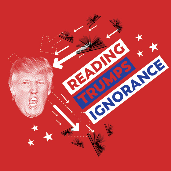
Next up is an alternate design for the Reading Trumps Ignorance t-shirt. I sort of knew that this one was going to be problematic from the get-go, but sometimes when you have an idea you just need to see it through, see where it ends up. While the concept of bouncing books off the face of the President was cathartic and fun to execute, at the end of the day I knew that the number of people that would want to wear a shirt with his face on it would not really make it viable.

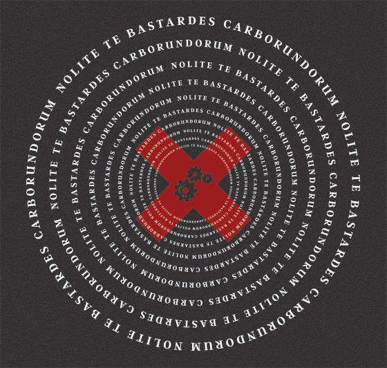
And here we have an alternate design for the Nolite te bastardes carborundorum shirt. When this task came to me I knew I wanted to focus on repetition of the text, like a mantra that someone repeats over and over. I felt like this design succeeded in creating a pseudo-hypnotic, visually striking composition, but where it falls a bit short is that in the repetition you sacrifice some of the immediate impact and boldness of the saying.

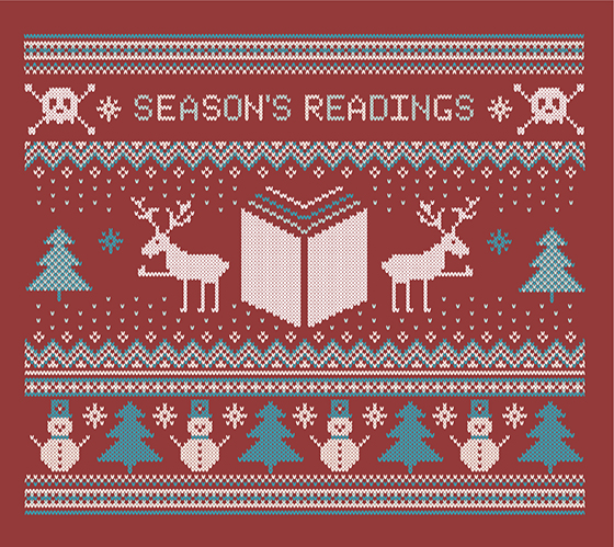
Lastly we have the design that never saw the light of day for an “ugly holiday sweater” Book Riot style. The problem with novelty designs is pretty inherent and we pulled the plug on this one before it could take flight.
[Jenn’s note: I still want this sweater.]

While not my intention, there was apparently some room for interpretation as to the motives of the reindeers in this motif. To be fair, Rebecca was merely the messenger for this request, but nonetheless I leave you with the most bizarre piece of feedback that I have ever received on a design:

-Scott