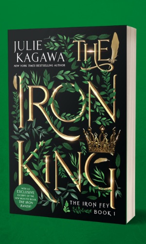
Sponsored by The Iron King by Julie Kagawa, published by Inkyard Press
The series the world fell in love with is back! Enter a fantastical world of dangerous faeries, wicked princes and one half-human girl who discovers her entire life is a lie. This special edition of The Iron King includes the bonus novella “Winter’s Passage” and an exclusive excerpt from the new Iron Fey book, The Iron Raven.
Hey YA Readers!
One of the things I love about YA books is thinking about and delving into the whys of their cover design. Why was this particular font used? Why was the cover a stock image rather than an illustration? And, perhaps the one I think about the most: why does a YA book get one design in hardcover and a new one in paperback?
The answer to that last question is wide. Sometimes the initial cover didn’t convey the story well. Sometimes it didn’t land with an audience. And sometimes, it could be an entirely different and mysterious answer relating to trends or marketing or any other variable.
Let’s take a peek at some recent YA redesigns. The image on the left will be the hardcover, while the one on the right, paperback. Which do you like? Is there one you’d purchase over another?
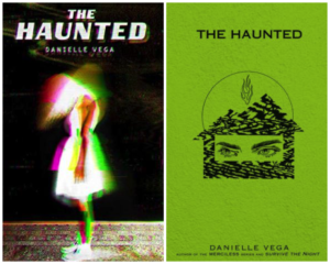
The one on the right is definitely creepier, but the one on the right seems to stand out a little bit more because it’s bright green. For a horror novel, I think both covers work pretty well — they just give off different vibes.
This is the first book in a series, and the rest of the books in the series will keep the design scheme on the right.
Crossing Stones by Helen Frost
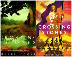
Frost’s historical novel in verse has been out for many years, but it’s getting repackaged and republished in July. The redesign is definitely fresher and eye-catching, don’t you think?
Love and Other Carnivorous Plants by Florence Gonsalves
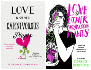
Both of these covers are pretty appealing to the eye, but I do really dig the font, the heart in a jar, and the more heavily illustrated design of the paperback. It tells a little bit more about the story, I think, than the original.
Hungry Hearts edited by Elsie Chapman and Caroline Tung Richmond
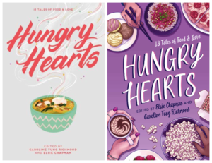
Every time I see the new paperback of this anthology, I remember how I still need to read it. I love the original cover, but something about the design, the way the elements are crowded and comfortable, and the way that everyone is together with food around the book title on the paperback really sing.
Frankly In Love by David Yoon
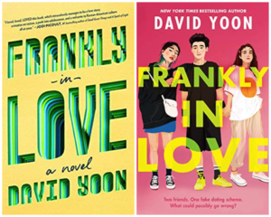
The redesign for this cover seems to me about audience. The original hardcover design — which is beautiful — feels very much like it’s trying to reach an adult audience. The paperback, on the other hand, features illustrated Asian American teens front and center, and seems to scream “this is a book for teens.” I especially love the juxtaposition of the male at the center of the book cover with the pink background.
What do you think? Prefer one over the other?
Thanks for hanging out, and we’ll see you later this week! Until then, keep on reading.
— Kelly Jensen, @heykellyjensen on Instagram and editor of Body Talk, (Don’t) Call Me Crazy, and Here We Are.
