It is mid-August, which means it is time for a new deal and another peak behind the scenes! Our Art Director Scott Borchert sat down with Jenn to talk about what exactly it looks like to be in the design trenches for Book Riot. But first, your exclusive Insiders deal of the month:
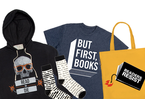
Get $25 off any purchase of $100 or more, using code BIGDEALINSIDE!
Jenn: I heard a rumor that your cat has appeared in more than one Book Riot campaign. Care to confirm?
Scott: The rumor is true. My cat, Danzig, has been my best friend since I found him in the bushes 14 years ago. We have been through a heck of a lot over the years, but it does not change one cold, hard truth: my cat is a freeloader. One day I sat down with him and tried to explain to him the concept of money; how all the things that he enjoys in life, furminators, refrigerated cat food, the couch he sleeps on, are not free and that I have to pay money for them. We came to an understanding that he was going to do more to pitch in and the resulting agreement was that I could use his likeness to promote goods and products for Book Riot and he could continue to do what he does best: sleep and be awesome.

Jenn: Give us an idea of what your day-to-day is like. Is there such a thing as a normal day in the design world?
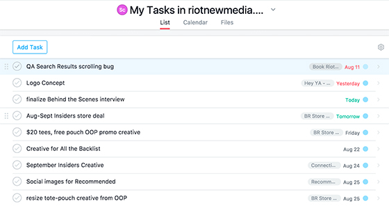
Scott: No, not really. And I guess that is what I like most about what I do. There is very little redundancy from day to day as far as design is concerned at least. But most days start out something like this: I hop on the Q train at 57th/7th Avenue and head towards Downtown Brooklyn. I can usually squeeze in about a half hour of reading there. The office is a shared workspace type deal, that I share with our web developer Alex. An obscene amount of coffee is made and consumed whilst checking through Slack and catching up on any emails. Then it is on to Asana, the task management system that we use here at Book Riot to dole out tasks to one another. Let’s see what’s on the docket today…

Jenn: What’s your all-time favorite book?
Scott: Sort of inspired by this post on Book Riot, I was looking for something daunting to read on my phone during my commutes. I didn’t really know anything about Don Quixote other than 1. It’s long and 2. It’s old. I figured that this would make for a slog of a read, full of difficult, antiquated prose and that it would defeat me within a single train ride. I was wrong. I was hooked from the beginning and subsequently found myself laughing out loud during my commute. I didn’t, however, read the whole thing on my phone, so I guess it did defeat me in that regard. I think there is something to be said for the distance something has to travel between your original expectation and where it winds up to become an all-time favorite.
Jenn: What’s been the hardest design project you’ve worked on for Book Riot, and why?
Scott: Probably the New Release Index. We had never tackled something like that before and it was a pretty monumental undertaking for myself and Alex. There were so many decisions that had to be made on such a micro level to try create a seamless and intuitive user experience. You also learn with projects like this that just because you think you have come up with an elegant design solution, it is not always feasible from a programmatic standpoint. So there is give and take and constantly trying to find a middle ground that everyone is comfortable with. That was the hardest project based on size and scope, but there are other, smaller projects that can be challenging as well. Design is a funny thing and you can’t control where or when creativity or inspiration will hit you. There are projects where I know instantly what direction I want to take something, and others where I am flailing around helplessly in Photoshop for hours on end trying to make pieces fit together. I much prefer the former.
Jenn: Related, do you have an all-time favorite?
Scott: Book Riot Live – The Sequel. I thought the direction that we took achieved what I had set out to do, which was marry the excitement and energy of the event and that of NYC while staying playful and fun. It’s challenging but rewarding to take a concept and see it across so many different mediums, whether it’s a website, banner ads, t-shirts, posters, to an actual frickin’ giant custom neon sign. Who knew that you could get so much mileage out a pigeon wearing a bowler hat? Speaking of which, if anyone is interested giving a home to said neon sign, you can drop me a line here. It’s been living under my bed in my apartment since BRL and it’s looking for a new home.
Jenn: You work on everything from logo designs for podcasts, to site layout, to ad campaigns, to font choices for social images, to t-shirt and merchandise designs (and I’m probably missing some things in there). Is the design process different for each thing, or are there some things that are the same no matter what the end product is?
Scott: The process for each is pretty unique. Each has its own set of guidelines and limitations that must be adhered to. Creating a design for a t-shirt and designing a website are entirely different ends with different intended results. But there are common threads that tie all of them together. The way I try to look at it is like this: Book Riot is a company. It has a unique set of values and principles at its core that make it what it is. So long as in everything that I do, I can look at and see that it points back to those principles in some way, then I know that I am on the right track.
