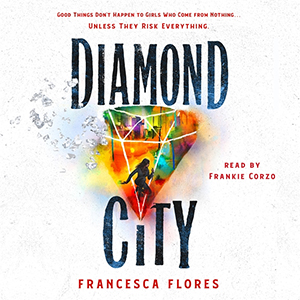
Sponsored by audiobook edition of Diamond City by Francesca Flores and read by Frankie Corzo.
Good things don’t happen to girls who come from nothing…unless they risk everything.
Aina Solís is as mysterious as the blood magic she protects. After the murder of her parents, Aina takes a job as an assassin to survive and finds a new family in those like her: the unwanted and forgotten.
DIAMOND CITY: built by magic, ruled by tyrants, and in desperate need of saving.
The audiobook of Diamond City, read by Frankie Corzo, is full of action, romance and dark magic. This first installment in Francesca Flores’ breathtaking fantasy duology will leave listeners eager for more!
Hey YA Readers!
Do you pay attention to book covers across different countries? I know I love taking a peek at how different publishers choose to highlight their books.
For many years, books published in the UK took advantage of more illustrated covers. If you’ve walked a book store any time in the last couple of years in the US, you’ve likely seen this is much more common here now than photographic covers. But even though the styles tend to be more similar now between the US and UK than previously, they can still present a different image all together.
Let’s take a peek at some of the US and UK covers of new and beloved YA book covers. Which do you prefer?
What Momma Left Me by Renée Watson
This book’s US and UK covers deserve a little back story first. This was Watson’s first book and it published 10 years ago with these covers (hardcover on left, paperback on right):
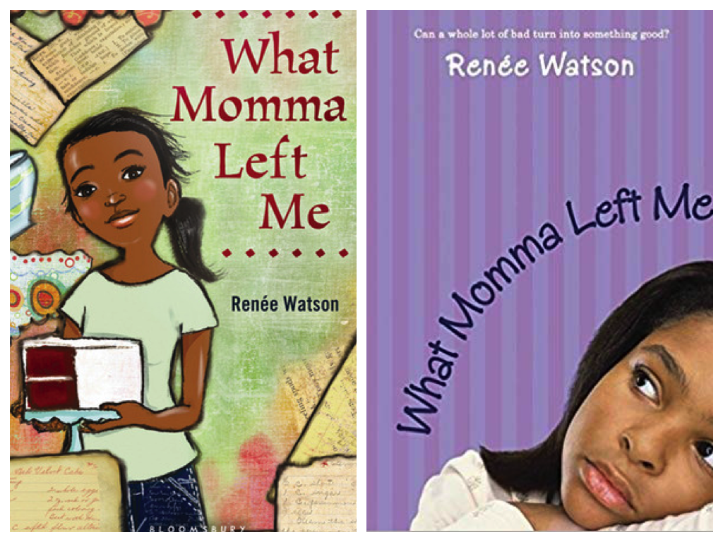
The initial hardcover was illustrated, but it certainly looks young. This is one of those books that falls right at the YA/MG divide, but the cover gives it a younger look. The paperback offers us a photograph and uses empty space pretty cleverly. But the font also reads fairly young.
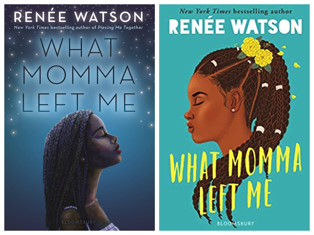
The cover on the left is the new US edition, which came out in 2019. It’s so lovely and appealing, both for middle grade and YA readers. The cover on the right is the UK edition, hitting shelves there for the first time. It captures a lot of the new US edition while also being wholly unique. I especially love the font for Renée’s name.
Clap When You Land by Elizabeth Acevedo (May 5)
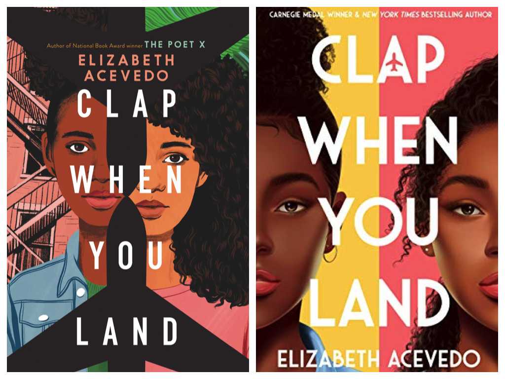
Both of these covers are powerful. The US edition includes fire escape ladders, which gives it such an urban feel. On the right, that aspect is missing and while the planes aren’t as obvious on the UK edition, if you peek at the “A” in Clap, you’ll see it.
One Of Us Is Next by Karen M. McManus
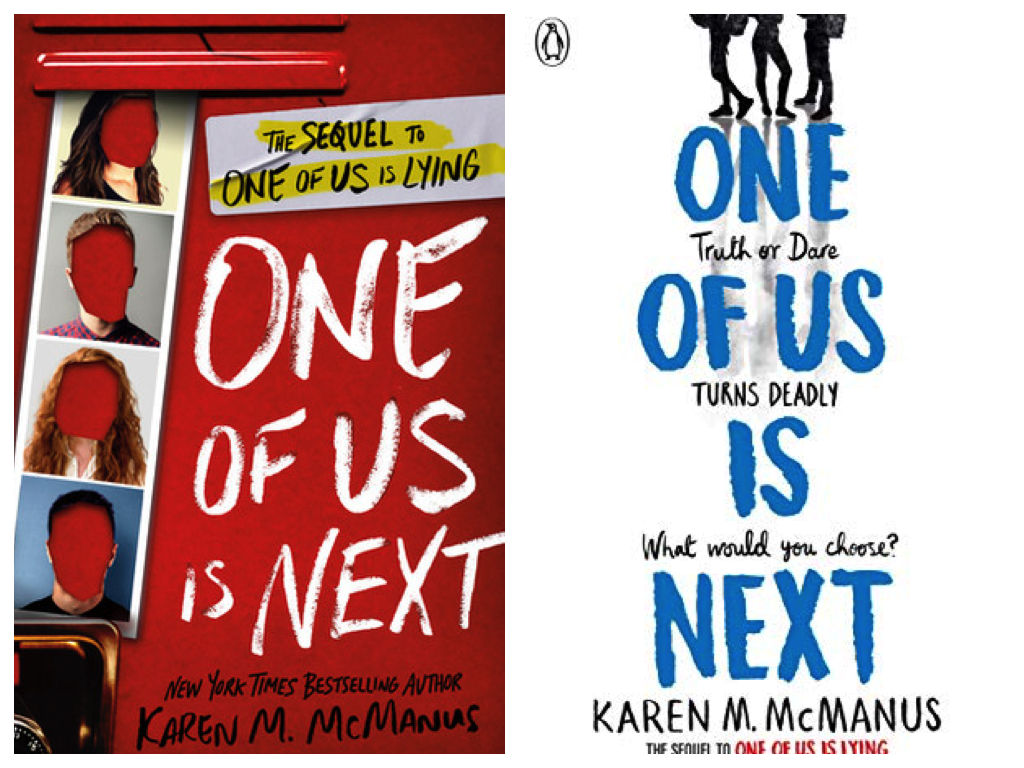
The US cover on the left is really different from the UK cover on the right. Both convey the high school setting well, but it’s different. The UK edition includes a tag line which, for me, makes it a little more compelling than the visuals of the US edition (“Truth or dare turns deadly. Which would you choose?”).
Yes No Maybe So by Becky Albertalli and Aisha Saeed
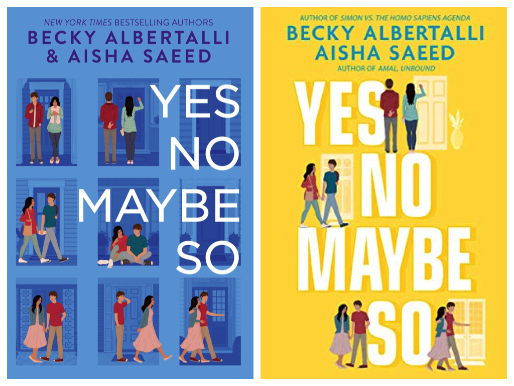
I love the ways that the UK cover on the left and the US cover on the right connect and diverge. The teens on the covers wear the same outfits in each line, have the same stances in them, and yet, it’s not just the color change that makes them different. It’s the font and focus on the title.
I’d love to know about the choice to put the plant outside the door on the top of the UK cover, where it’s not present in the US edition (or a part of the story, as far as I remember).
Foul Is Fair by Hannah Capin
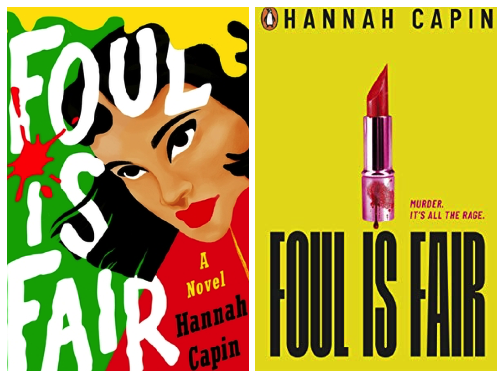
Both the US cover, featuring a maximalist palate of colors and shapes, as well as a fierce female on it, as well as the UK cover, with a little bloody lipstick, are eye-catching. It’s pretty clear this isn’t a rom com, I think, but rather, a story of revenge. I personally like the lipstick just a tiny bit more because of the way it’s so bare in execution and yet features a lot of clever little details (and the tag line helps, too). But talk about a US cover that’s unlike anything else out there now, too.
What do you think? Do you prefer the US or UK covers for any of these books?
Thanks for hanging out, y’all, and we’ll see you later this week!
— Kelly Jensen, @heykellyjensen on Instagram and editor of (Don’t) Call Me Crazy and Here We Are.
**Psst — you can now also preorder my upcoming August release, Body Talk: 37 Voices Explore Our Radical Anatomy!